50Languages App
Redesign
50Languages is a learning platform that offers a direct, non-gamified, textbook-like approach to language learning. It focuses on real-world vocabulary and phrases, making it ideal for learners who prefer practical, goal-oriented progress over gamified elements.
50Languages is a learning platform that offers a direct, non-gamified, textbook-like approach to language learning. It focuses on real-world vocabulary and phrases, making it ideal for learners who prefer practical, goal-oriented progress over gamified elements.
50Languages is a learning platform that offers a direct, non-gamified, textbook-like approach to language learning. It focuses on real-world vocabulary and phrases, making it ideal for learners who prefer practical, goal-oriented progress over gamified elements.


Project type
Personal redesign / UI & UX improvement
Personal redesign / UI & UX improvement
Date
October - November 2024
October - November 2024
Role
UI/UX Designer, Researcher
UI/UX Designer, Researcher
Tools
Figma, FigJam
Figma, FigJam
Problem Statement
The 50Languages mobile app offers free language-learning content but suffers from an outdated interface, cluttered screens, and inconsistent hierarchy.
The 50Languages mobile app offers free language-learning content but suffers from an outdated interface, cluttered screens, and inconsistent hierarchy.


Main flow of the original design: Menu screen - Select a category - Select a lesson - List of words
Main flow of the original design: Menu screen - Select a category - Select a lesson - List of words
Outcome
Simpler and more intuitive user flow
Simpler and more intuitive user flow
Improved readability and modern look
Improved readability and modern look
A friendlier, calmer learning experience
A friendlier, calmer learning experience

Context & Goal
I discovered the 50languages app while searching for a way to learn Polish. It immediately stood out because it offered language lessons from my native Croatian, which made learning much easier and more intuitive than through English. The similarities between the two languages — vocabulary, structure, and syntax — allowed me to learn faster and more naturally.
However, despite its excellent content, the app’s interface felt outdated and unintuitive — like something frozen in the early 2000s. As a beginner UI/UX designer at the time, I saw an opportunity to challenge myself by redesigning it: keeping its valuable learning structure, but reimagining it for today’s users with a clearer, more modern, and engaging experience.
I discovered the 50languages app while searching for a way to learn Polish. It immediately stood out because it offered language lessons from my native Croatian, which made learning much easier and more intuitive than through English. The similarities between the two languages — vocabulary, structure, and syntax — allowed me to learn faster and more naturally.
However, despite its excellent content, the app’s interface felt outdated and unintuitive — like something frozen in the early 2000s. As a beginner UI/UX designer at the time, I saw an opportunity to challenge myself by redesigning it: keeping its valuable learning structure, but reimagining it for today’s users with a clearer, more modern, and engaging experience.
I discovered the 50languages app while searching for a way to learn Polish. It immediately stood out because it offered language lessons from my native Croatian, which made learning much easier and more intuitive than through English. The similarities between the two languages — vocabulary, structure, and syntax — allowed me to learn faster and more naturally.
However, despite its excellent content, the app’s interface felt outdated and unintuitive — like something frozen in the early 2000s. As a beginner UI/UX designer at the time, I saw an opportunity to challenge myself by redesigning it: keeping its valuable learning structure, but reimagining it for today’s users with a clearer, more modern, and engaging experience.
Identifying Problems
Before redesigning, I analyzed the existing interface to find the most visible UX and UI issues.
Before redesigning, I analyzed the existing interface to find the most visible UX and UI issues.
Visual design of the app is very outdated and inconsistent (e.g. different types of icons)
Visual design of the app is very outdated and inconsistent (e.g. different types of icons)
Information architecture is monotonically dispersed and not clear enough
Information architecture is monotonically dispersed and not clear enough
Some options in the app don’t have any purpose (e.g. “Study plan” and “Your result” don’t open nor contain anything)
Some options in the app don’t have any purpose (e.g. “Study plan” and “Your result” don’t open nor contain anything)
Menu screen
Menu screen
Lesson screen
Lesson screen
Visual design of the app is very outdated and inconsistent (e.g. different types of icons)
Visual design of the app is very outdated and inconsistent (e.g. different types of icons)
App lacks some desirable quality of life functions (e.g. more responsive lesson functions)
App lacks some desirable quality of life functions (e.g. more responsive lesson functions)
Main screen
Main screen

Choose a lesson (?) screen
Choose a lesson (?) screen
Choose a category screen
Choose a category screen
Lesson or test (?) screen
Lesson or test (?) screen
Lesson screen
Lesson screen
User flow is confusing (the app does not offer any guides or directions while it is mixed with bad visual hierarchy)
User flow is confusing (the app does not offer any guides or directions while it is mixed with bad visual hierarchy)
My goal was to simplify, modernize, and make the experience more encouraging.
My goal was to simplify, modernize, and make the experience more encouraging.
Design Approach
I started by reorganizing the information architecture and simplifying the main navigation. Typography and color choices were adjusted for readability, balance, and modern tone.
I started by reorganizing the information architecture and simplifying the main navigation. Typography and color choices were adjusted for readability, balance, and modern tone.
The main focus was clarity and motivation — keeping users aware of their learning progress while reducing distractions.
The main focus was clarity and motivation — keeping users aware of their learning progress while reducing distractions.
3 major improvements
The 3 most prominent improvements of the new design include:
The 3 most prominent improvements of the new design include:
New structural layout in Menu screen (intuitive navigation, division into 3 familiar sections, hierarchy of categories, etc...)
New structural layout in Menu screen (intuitive navigation, division into 3 familiar sections, hierarchy of categories, etc...)

Clear visual hierarchy and layout in Lessons screen (lessons and tests are all on one screen, additional functions such as audio control, etc...)
Clear visual hierarchy and layout in Lessons screen (lessons and tests are all on one screen, additional functions such as audio control, etc...)

Adding of Profile screen for personalization of one’s data and statistics (simple access and editing of information,...)
Adding of Profile screen for personalization of one’s data and statistics (simple access and editing of information,...)

New logo
I have added myself also a bit of liberty for redesigning the company’s logo in order to align it with the overall project’s refreshed look while keeping the identity of the brand.
I have added myself also a bit of liberty for redesigning the company’s logo in order to align it with the overall project’s refreshed look while keeping the identity of the brand.

I also tested early wireframes with a few users to confirm that navigation and task flow were more intuitive than in the original design.
I also tested early wireframes with a few users to confirm that navigation and task flow were more intuitive than in the original design.
New Design
Final design
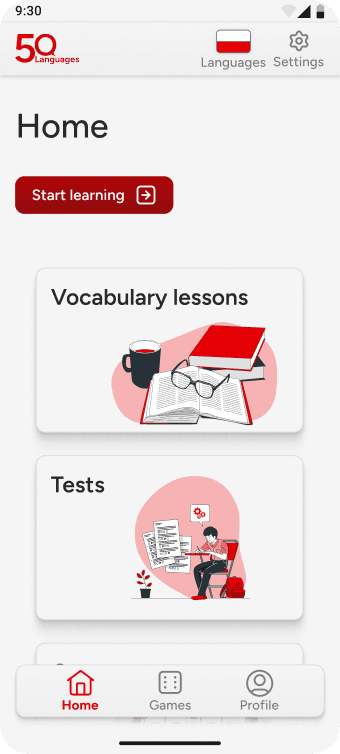
The redesigned interface uses:
The redesigned interface uses:
A light, clean layout for better readability
A light, clean layout for better readability
Clear navigation structure and stronger focus on active lessons
Clear navigation structure and stronger focus on active lessons
Visual consistency across screens
Visual consistency across screens
More intuitive hierarchy and simplified icons
More intuitive hierarchy and simplified icons
Each screen aims to help users stay focused and confident in their progress.
Each screen aims to help users stay focused and confident in their progress.
Outcome
The new design achieves:
The new design achieves:
Simpler and more intuitive user flow
Simpler and more intuitive user flow
Improved readability and modern look
Improved readability and modern look
A friendlier, calmer learning experience
A friendlier, calmer learning experience
System usability scale (SUS)
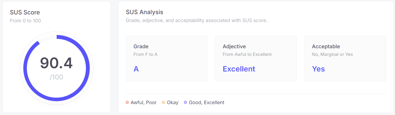
The SUS score grades the usability of the app as “Excellent.”
The SUS score grades the usability of the app as “Excellent.”
Potential improvements
I have listed a couple out of dozens of potential improvements that I noticed:
I have listed a couple out of dozens of potential improvements that I noticed:
The content of already existing exercises can be iterated and improved by better formulating what is being learned and it’s repetitiveness cycle
The content of already existing exercises can be iterated and improved by better formulating what is being learned and it’s repetitiveness cycle
Addition of new types of exercises, such as TPRS (Teaching Proficiency Through Reading and Storytelling) or recorded conversations with subtitles for easier following
Addition of new types of exercises, such as TPRS (Teaching Proficiency Through Reading and Storytelling) or recorded conversations with subtitles for easier following
More researching and testing
More researching and testing
Reflection & Insights
This project was my first complete UI/UX redesign, and it taught me how to analyze an existing product critically — understanding what doesn’t work and translating that into clear, practical design improvements. It helped me recognize the impact of small details on usability and visual flow, and it strengthened my confidence in applying design systems consistently.
This project was my first complete UI/UX redesign, and it taught me how to analyze an existing product critically — understanding what doesn’t work and translating that into clear, practical design improvements. It helped me recognize the impact of small details on usability and visual flow, and it strengthened my confidence in applying design systems consistently.
Main flow of the original design: Menu screen - Select a category - Select a lesson - List of words
3 major improvements
The 3 most prominent improvements of the new design include:
New structural layout in Menu screen (intuitive navigation, division into 3 familiar sections, hierarchy of categories, etc...)
Clear visual hierarchy and layout in Lessons screen (lessons and tests are all on one screen, additional functions such as audio control, etc...)
Adding of Profile screen for personalization of one’s data and statistics (simple access and editing of information,...)
New logo
I have added myself also a bit of liberty for redesigning the company’s logo in order to align it with the overall project’s refreshed look while keeping the identity of the brand.
I also tested early wireframes with a few users to confirm that navigation and task flow were more intuitive than in the original design.
Final design
The redesigned interface uses:
A light, clean layout for better readability
Clear navigation structure and stronger focus on active lessons
Visual consistency across screens
More intuitive hierarchy and simplified icons
Each screen aims to help users stay focused and confident in their progress.


Outcome
System usability scale (SUS)
The SUS score grades the usability of the app as “Excellent.”
The new design achieves:
Simpler and more intuitive user flow
Improved readability and modern look
A friendlier, calmer learning experience
Reflection & Insights
New Design
Potential improvements
I have listed a couple out of dozens of potential improvements that I noticed:
The content of already existing exercises can be iterated and improved by better formulating what is being learned and it’s repetitiveness cycle
Addition of new types of exercises, such as TPRS (Teaching Proficiency Through Reading and Storytelling) or recorded conversations with subtitles for easier following
More researching and testing
This project was my first complete UI/UX redesign, and it taught me how to analyze an existing product critically — understanding what doesn’t work and translating that into clear, practical design improvements. It helped me recognize the impact of small details on usability and visual flow, and it strengthened my confidence in applying design systems consistently.
Jump to
Jump to
Jump to
Jump to